Advanced Conditional Logic allows your form to dynamically adapt based on user interactions. By showing, hiding, or altering fields based on previous answers, you can create shorter, personalized, and higher-converting multi-step submission experiences.
What is Conditional Logic?
Conditional logic triggers specific form fields to appear or stay hidden depending on a visitor's inputs.
Example: If a customer selects "Yes" to a question like "Do you own a business?", a follow-up text field asking for their "Company Name" will automatically appear.
Supported Trigger Elements
Conditional logic rules can only be triggered by the following input elements:
Dropdown
Radio Button
Multiple Choice
Checkbox
Step-by-Step Setup Guide
Step 1: Add and Save Your Trigger Element
Open your form and go to Form design → Form elements.
Add a supported trigger element (Dropdown, Radio button, Multiple choice, or Checkbox).
Input your selection options into the Value field, placing each option on a new line.
⚠️ Critical Step: Click Save. You must save your form now so the system indexes these options for subsequent elements.
Step 2: Configure Conditional Rules on Target Elements
Add or select the target element (the field you want to show or hide dynamically).
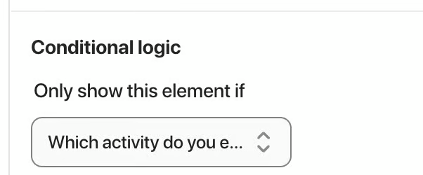
Locate the Conditional Logic section inside the target element's settings.
Select the trigger element you created in Step 1.
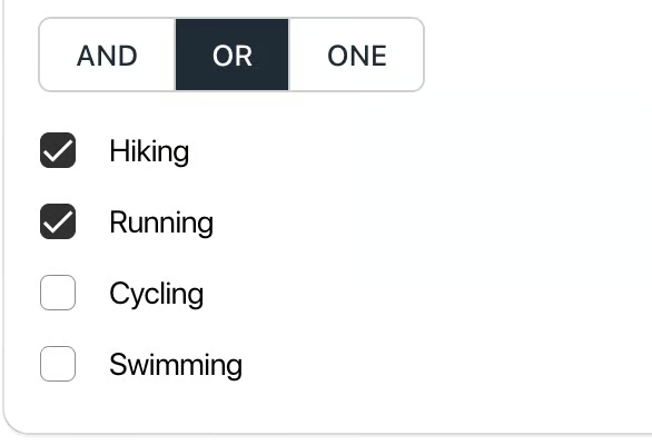
Choose the logic rule condition: AND, OR, or ONE.
Click Save to apply your conditional logic rules.
Logic Operators & Element Compatibility
When setting conditions on your target element, select the operator that matches your desired behavior:
AND: The element appears only when ALL specified options are selected simultaneously.
OR: The element appears when ANY of the selected options are chosen.
ONE: The element appears only when ONE specific single option is selected.
Element Compatibility Matrix
Dropdown Element: Supports
ORandONEoperators.Radio Button Element: Supports
ORandONEoperators.Multiple Choice Element: Supports
AND,OR, andONEoperators.Checkbox Element: Supports
ONEoperator.
Was this article helpful?
That’s Great!
Thank you for your feedback
Sorry! We couldn't be helpful
Thank you for your feedback
Feedback sent
We appreciate your effort and will try to fix the article